


Short answer: Minimalist design strips away excess to highlight what matters. It works because the human brain has limited cognitive load, so clean interfaces, intentional space, and restrained colour palettes reduce fatigue and build trust. Brands like Apple, Google, Airbnb, Muji, and Uniqlo use it to feel confident and sustainable.
We live in an era of overstimulation: flashing ads, crowded interfaces, and constant notifications fight for our attention. Amid all this noise, minimalist design has emerged not as a style but as a philosophy. It is the art of stripping away excess to reveal what matters. In architecture, digital products, and branding, minimalism speaks a single truth: clarity is powerful.
In a world addicted to more, the best designers are choosing less. Less clutter, fewer distractions, more meaning. The rise of minimalist design is proof that simplicity has become the highest form of sophistication.
Where did minimalist design come from?
Minimalism as an artistic movement began in the 1960s, drawing from Japanese Zen philosophy and Bauhaus design principles. The Bauhaus school pushed function over form. Japanese aesthetics focused on harmony, balance, and emptiness.
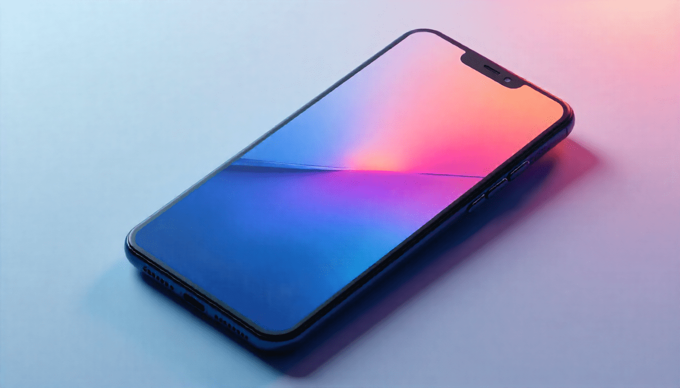
When those philosophies met, they produced a timeless approach to design where every element serves a purpose. Apple’s product philosophy owes a lot to this lineage. The iPhone’s sleek, unembellished design was revolutionary precisely because it was so simple.
Why does minimalist design work?
Minimalist design works because it respects attention. In psychology, the principle of cognitive load explains that the human brain can only process a limited amount of information at once. A cluttered design causes decision fatigue. A simple one lets people navigate effortlessly, knowing what to do, where to look, and how to feel.
A minimalist design doesn’t mean empty space for the sake of it. It means intentional space. Every line, colour, and word must justify its existence. That discipline turns simplicity into strength.
How is minimalism used in digital design?
In the digital world, minimalist design has become a standard for usability and aesthetics. Clean interfaces, muted colour palettes, and generous white space help users focus on function instead of decoration.
Brands like Google, Airbnb, and Spotify have adopted minimalist UI not just to look modern but to be usable. Their interfaces feel calm and intuitive because they respect how people behave.
Micro-interactions, typography, and subtle animations have replaced overdesigned visuals. In an attention-driven economy, simplicity is a strategy, not a limitation.
How does minimalist design affect emotion?
Minimalism doesn’t only look good. It feels good. Psychologists have found that uncluttered visual environments reduce stress and improve focus. The clean lines and balanced proportions of minimalist design mirror our desire for order in an overwhelming world.
That is why minimalist spaces, digital or physical, often evoke calm, trust, and sophistication. A well-designed minimalist website communicates confidence through restraint. It suggests a brand that knows who it is and what it stands for.
Why do brands use minimalist branding?
Minimalist branding has dominated the last decade. From fashion labels to tech startups, brands are simplifying their logos, reducing colour palettes, and embracing typography-driven identities.
Nike’s swoosh, Apple’s bitten apple, and McDonald’s golden arches show how simplicity can transcend language. A simple visual identity becomes timeless, adaptable, and instantly recognisable.
Consumers are also drawn to brands that mirror their own desire for clarity and purpose. Minimalist branding isn’t about looking pretty. It is about communicating authenticity and trust through simplicity.
Is minimalist design boring?
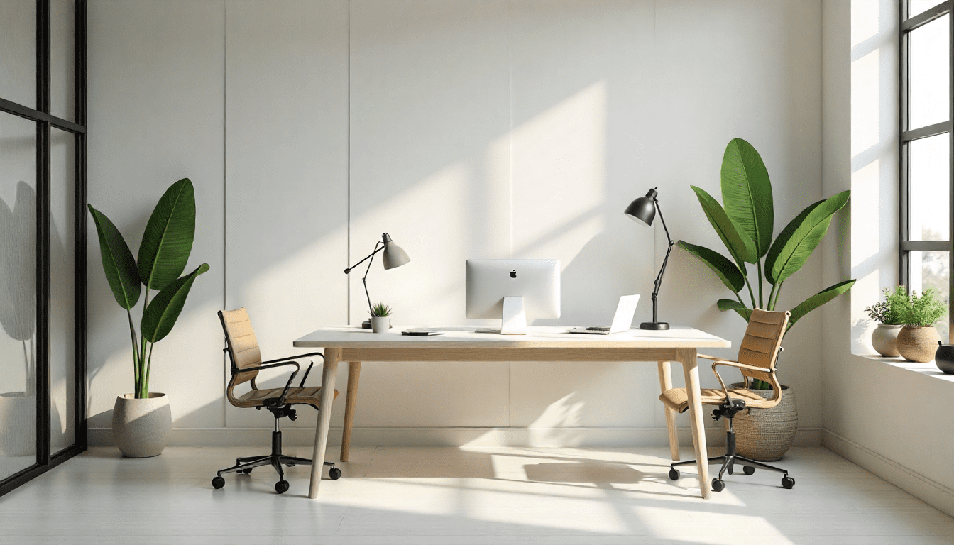
One of the biggest misconceptions about minimalism is that it is plain or boring. In reality, true minimalist design balances simplicity with personality. The goal isn’t to remove emotion. It is to remove distraction.
The best minimalist designs have soul. They use colour, typography, or shape to convey character in small doses. Think of Muji’s serene packaging, Tesla’s clean product lines, or the understated elegance of fashion brands like COS and Uniqlo. Each has a distinct identity with minimal expression.
Minimalism is not absence. It is precision.
Is minimalist design sustainable?
Minimalism lines up with sustainability. Designing less often means wasting less. From eco-friendly packaging to modular architecture, minimalist principles promote efficiency and resource awareness.
Many brands are embracing sustainable minimalism: reducing product lines, using recyclable materials, and creating longer-lasting designs. The “buy less, choose well” ethos has become both an aesthetic and an ethical statement.
The shift reflects a deeper cultural change. People are realising that simplicity isn’t only beautiful. It is responsible.
How do you apply minimalism to your own work?
Whether you’re a designer, creator, or someone who wants to simplify, the minimalist approach can reshape your work and mindset. A short playbook:
- Prioritise clarity over complexity. Ask what purpose every element serves. If it doesn’t add value, remove it.
- Use whitespace intelligently. Space is not empty. It is breathing room for ideas.
- Limit your colour palette. A few well-chosen hues create harmony and sophistication.
- Focus on typography. Strong type choices can carry emotion better than any graphic.
- Embrace restraint. Minimalism is about knowing when to stop.
Apply these principles and your design, whether a poster, website, or workspace, becomes cleaner, more intentional, and more impactful.
Conclusion: The future belongs to the minimalists
As technology advances and visual noise increases, minimalism isn’t fading. It is evolving. It is becoming the language of the future: efficient, clear, and human-centred.
In design, as in life, simplicity isn’t a lack of ambition. It is the highest form of mastery. The world doesn’t need more clutter. It needs more clarity.
Minimalist design reminds us that when everything screams for attention, the quietest thing in the room often speaks the loudest.
FAQs about minimalist design
What is minimalist design in simple words?
Minimalist design is the practice of removing anything unnecessary so only the essential elements remain. Every line, colour, and word must earn its place, which is why brands like Apple and Muji use it to feel confident and calm.
Why is minimalism popular with Gen Z?
Gen Z grew up in a visually overloaded world of feeds, pop-ups, and ads. Minimalism offers a break from that noise and signals clarity, authenticity, and self-control, values many young Indians actively look for in the brands they follow.
What colours work best for minimalist design?
There is no fixed palette, but most minimalist work limits itself to two or three colours, often neutrals like white, black, grey, or soft pastels, with one accent hue. The point is restraint, not a specific shade.
How is minimalism different from being plain?
Plain design lacks intention. Minimalist design is deeply intentional. It uses typography, proportion, and whitespace to express personality without clutter, as seen in Tesla’s product lines, COS’s fashion, or Airbnb’s interface.
How can I make my social media feed more minimalist?
Pick a small colour palette, stick to one or two fonts, leave generous white space around each post, and remove any element that doesn’t help tell your story. Consistency is what makes a minimalist feed feel like a brand.