


Short answer: Color psychology is the study of how colors shape emotion and decision-making in branding. Research shows color influences up to 85% of consumer purchasing decisions and consistent palettes lift brand recognition by 30%. Leading brands — Coca-Cola, Apple, Google, McDonald’s — choose colors deliberately to trigger trust, appetite, luxury or optimism.
Every scroll, click and purchase you make is shaped by color — whether you notice it or not. From Coca-Cola’s vibrant red to Apple’s minimalist white, color psychology guides how consumers feel, decide, and connect with brands.
In 2025’s fast-paced digital landscape, where attention spans last seconds, mastering color has become a core weapon of modern branding.
What is the science behind color psychology?
Colors are not only aesthetic. They are neurological triggers. Studies show color influences up to 85% of consumer purchasing decisions, and brands with consistent palettes see a 30% higher recognition rate.
Here is how some hues speak to the subconscious:
Red: Urgency, energy and appetite (used by Coca-Cola, Netflix, YouTube)
Blue: Trust, calmness and professionalism (used by Facebook, LinkedIn, PayPal)
Yellow: Optimism and warmth (used by McDonald’s, Snapchat)
Green: Health, balance and growth (used by Spotify, Whole Foods)
Black and White: Luxury, simplicity and authority (used by Apple, Chanel)
These colors aren’t chosen by chance. They are crafted to trigger specific emotional responses.
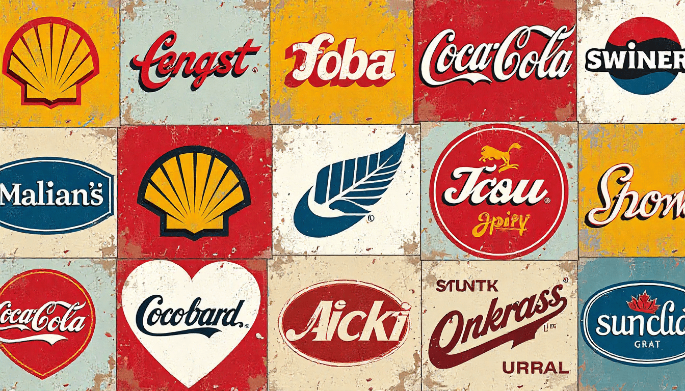
How do brands build identity through color?
The best brands use color as a language. Apple’s grayscale minimalism signals precision and luxury. IKEA’s blue and yellow reflects trust and positivity. Google’s multicolor logo represents creativity and diversity.
Every tone, shade and gradient adds to the brand’s emotional narrative — the feeling you get before you read the tagline.
Brands that line up color strategy with personality build instant visual recognition, and that creates loyalty faster than any slogan.
Why does cultural context matter in color?
Colors carry different meanings across regions. In Western markets, white often signals purity and simplicity. In Eastern cultures, it can signify mourning. Red may represent danger in one country and celebration in another.
Global brands like Nike and McDonald’s adapt color messaging subtly across regions to stay culturally sensitive while keeping their identity intact.
Understanding context is the difference between a universal brand and a tone-deaf campaign.

Why are brands shifting to muted and minimal palettes?
Digital fatigue has pushed brands toward muted, minimalist palettes. Notion, Nothing, and Airtable use calm neutrals and pastels to signal clarity and mental space — a visual antidote to overstimulation.
Even bold brands are cleaning up. The 2020s have brought a wave of rebrands removing gradients and heavy saturation in favor of flat, grounded colors that feel authentic.
The mood this reflects is clear: simplicity is the new sophistication.
How do colors shape digital design?
In UI and web design, colors drive user trust, engagement and navigation.
Warm tones encourage interaction and call-to-action clicks.
Cool tones lift readability and focus.
Contrast makes design accessible and inclusive.
A balanced palette can raise conversion rates and dwell time — proof that emotional design drives tangible results.
How is AI changing the future of color design?
AI tools like Khroma, Huemint, and Adobe Firefly are reshaping how designers pick colors. They use machine learning to weigh emotional resonance, cultural trends and visual balance, then suggest palettes that match a brand’s story.
Soon, expect adaptive branding: websites and ads that shift colors based on user emotion, time of day, or mood detected through sensors. Color will no longer be static — it will be alive.
Color as the soul of branding
In branding, color isn’t the finishing touch. It is the foundation. It speaks before words, connects before logic, and stays long after the campaign ends.
The brands that understand this will thrive in a world where attention is fleeting but emotion is forever.
Because in design, color doesn’t just decorate — it communicates.
FAQs about color psychology in branding
What is color psychology in branding?
Color psychology in branding is the study of how specific hues trigger emotion, decision-making and memory. It explains why brands pick certain palettes — Coca-Cola’s red for appetite and urgency, Apple’s grayscale for luxury, Spotify’s green for growth.
How much does color influence purchasing?
Studies show color influences up to 85% of consumer purchasing decisions, and brands that keep a consistent palette see around 30% higher recognition compared with inconsistent ones.
Why do so many tech brands use blue?
Blue signals trust, calmness and professionalism, which is why Facebook, LinkedIn and PayPal lean on it. For platforms that ask users to share personal or financial data, those cues matter.
What are the current color trends in branding?
Muted, minimalist palettes are dominant. Brands like Notion, Nothing and Airtable use neutrals and pastels, while many heritage brands are dropping gradients and heavy saturation for flat, clean colors.
Which AI tools help pick brand colors?
Khroma, Huemint and Adobe Firefly use machine learning to analyse emotional resonance and cultural trends, then suggest palettes that fit a brand’s story and audience.