
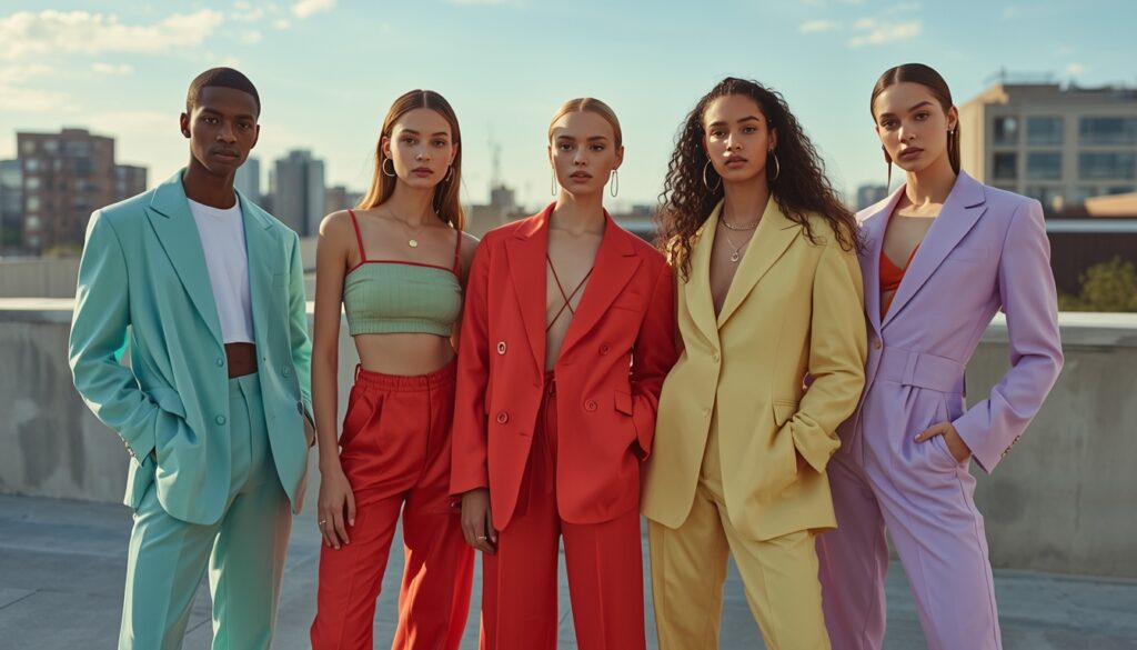
Short answer: The five Gen Z summer colours leading the season are Digital Aqua, Strawberry Red, Matcha Green, Butter Yellow, and Lavender Haze. They photograph well, carry emotional weight, work across gender and body types, and match the micro-aesthetics ruling Instagram and TikTok.
For Gen Z, summer colours are not only seasonal choices. They are emotional cues. They signal mood, identity, and aesthetic alignment. Scroll through Instagram or TikTok for five minutes and you will notice something striking: colour is no longer subtle. It is intentional. Camera-aware. Expressive.
According to Pinterest’s annual trend forecasts, searches for vibrant and nostalgic colour palettes consistently spike before summer (Pinterest Predicts, 2024). Fashion search platform Lyst has reported increased demand for pastel tones and bold brights driven largely by Gen Z consumers (Lyst Index, 2023).
From my own observation, and yes, a few impulsive shopping decisions, these five colours are leading the charge this season.
Why is Digital Aqua the electric statement of the season?
If summer had a soundtrack, Digital Aqua would be its visual equal.
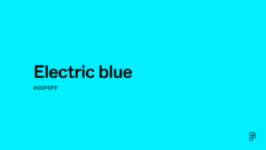
This electric blue, almost neon in certain lights, feels futuristic. It pops on camera. It dominates streetwear. I recently saw a college student pair an oversized aqua shirt with white cargos and chunky sneakers. The outfit was simple, yet the colour made it unforgettable.
Why does it resonate? It is bold without being aggressive. It reflects a tech-forward, hyper-online identity. In a generation raised on screens, colours that perform well digitally matter. Aqua does not fade into the background. It commands attention.
What makes Strawberry Red playful and powerful?
Not crimson. Not burgundy. Strawberry Red sits somewhere in between: warm, juicy, and unmistakably summer-ready.
This shade gained traction alongside the “strawberry girl” aesthetic that trended heavily on social platforms last year. It is romantic without being fragile. Confident without being intimidating.
I tried a strawberry-toned shirt this season, and it changed how I felt walking into a room. Colour psychology studies suggest red tones can evoke feelings of excitement and confidence (Elliot & Maier, 2014). For Gen Z, that emotional lift matters as much as the aesthetic appeal.
Why is Matcha Green the calm cool shade of summer?

Matcha Green represents the softer side of the spectrum. It is muted, earthy, and subtly chic.
This shade aligns with wellness culture, sustainability narratives, and minimalist fashion. Think linen co-ords, oversized shirts, or structured trousers in this dusty green.
What makes it interesting is how it bridges aesthetics. It fits the “clean girl” look as easily as it complements a slow-living, café-core vibe. It whispers rather than shouts. In a world of constant digital noise, that restraint feels refreshing.
How does Butter Yellow deliver sunshine without the noise?
Butter Yellow might be the most versatile shade of the season.

Soft. Warm. Slightly nostalgic.
Unlike neon yellow, which demands attention, Butter Yellow glows quietly. It photographs beautifully in natural sunlight, which explains its popularity in vacation posts and summer lookbooks.
The appeal also lies in its universality. It flatters diverse skin tones and works across silhouettes, from sundresses to oversized graphic tees. There is optimism in this shade. After years of global uncertainty, optimism is exactly what fashion is leaning toward.
What does Lavender Haze bring to Gen Z style?

Lavender continues to hold its ground. Playful but mature. Soft yet distinctive.
This pastel purple works across gender lines, which makes it relevant in a generation that embraces fluid styling. Layered under a blazer or styled in monochrome streetwear, Lavender Haze adapts.
Its emotional resonance stands out most. Purple tones are often associated with creativity and imagination (Color Research & Application Journal, 2016). For a generation that values individuality, that symbolism feels aligned.
Why do these colours matter for Gen Z fashion?
Gen Z fashion is tied to digital culture. Outfits are curated not only for real life, but for the lens. Colours must translate well on screens. They must align with micro-aesthetics. They must tell a story.
These five shades share common traits:
- They photograph well.
- They evoke emotion.
- They allow self-expression.
- They adapt across gender and style categories.
This is not random trend cycling. It is intentional visual storytelling.
How should you choose your summer shade?
Fashion has always been a reflection of its era. Today’s era is digital, expressive, and unapologetically visual.
The next time you pick a summer outfit, pause for a moment. Ask yourself not only what looks good, but what feels aligned. For Gen Z, colour is not decoration. It is declaration.
This summer, the boldest statement you can make begins with the shade you choose to wear.
FAQs about Gen Z summer colours
What are the top Gen Z summer colours this year?
The five Gen Z summer colours leading the season are Digital Aqua, Strawberry Red, Matcha Green, Butter Yellow, and Lavender Haze.
Which summer colour works best on camera?
Digital Aqua performs strongest on camera because its electric blue tone pops in photos and video, which is why it dominates streetwear feeds.
Is Butter Yellow good for all skin tones?
Yes. Butter Yellow is especially versatile because it flatters diverse skin tones and works across silhouettes, from sundresses to oversized graphic tees.
Why is Matcha Green trending in Gen Z fashion?
Matcha Green aligns with wellness culture, sustainability narratives, and minimalist fashion, making it fit both the “clean girl” aesthetic and the slow-living café-core vibe.
What emotions do these summer colours evoke?
Red tones can evoke excitement and confidence (Elliot & Maier, 2014), while purple shades are linked to creativity and imagination (Color Research & Application Journal, 2016). Aqua reads futuristic, matcha feels calm, and butter yellow signals optimism.