
Short answer: Good UI design shapes behaviour by reducing cognitive load, triggering emotion through colour and micro-interactions, and keeping users in a flow state. Since 90% of information the brain absorbs is visual and attention spans have dropped to around eight seconds, clarity and simplicity now decide whether users trust a product. The future of UI is AI-driven, adaptive, and held together by ethics, not dark patterns.
The best user interfaces are the ones you don’t notice. You tap, swipe, scroll, and somehow everything works. Buttons feel right, colours guide attention, and the layout quietly leads you toward what you want to do.
That’s the magic of good UI design: it’s invisible. Behind every click and gesture lies a world of psychology, strategy, and storytelling. In the modern digital era, design isn’t about how something looks; it’s about how it feels. The interface is no longer a medium. It’s the experience itself.
How does every tap influence behaviour?
Every design decision influences behaviour. The size of a button, the timing of an animation, or even the shade of a colour can shape how users feel and act.
The human brain processes visuals faster than words. In fact, 90% of the information we absorb is visual. A clean, intuitive design reduces cognitive load. It lets the brain relax and focus on the task instead of figuring out how the interface works. In UI design, clarity is empathy. The easier something is to use, the more human it feels.
How does UI design use emotion?
UI design is emotional engineering. Every screen can make a user feel trust, excitement, calm, or curiosity.
Colours evoke emotion: blue builds trust, red creates urgency, green feels safe. Typography carries tone too. Serif fonts convey tradition, while sans-serif communicates modernity. Even micro-interactions, like a smooth button transition or a satisfying click sound, release tiny doses of dopamine that make digital experiences addictive.
When you design emotion, you design loyalty. People don’t remember what a product did. They remember how it made them feel.
Why is simplicity the hardest design principle?
The simplest designs often require the most thought. True simplicity isn’t about removing elements. It’s about removing confusion.
Minimalism in UI isn’t an aesthetic. It’s a philosophy. Every element must earn its place. When done right, minimalism communicates confidence. It says: “We know what matters most.”
Apple, Google, and Airbnb mastered this principle. Their interfaces aren’t only clean; they’re calm. They let the product speak for itself without shouting for attention. Simplicity doesn’t mean less. It means essential.
What is the flow state in UI design?
A well-designed interface creates what psychologists call flow: a mental state where users are fully immersed in the experience and lose track of time.
Flow happens when difficulty and skill are balanced. Too easy, and users get bored. Too complex, and they get frustrated. The goal of UI design is to create that harmony, guiding users from one action to the next.
Netflix’s autoplay, Instagram’s swipe transitions, and Spotify’s navigation are examples of design that sustains flow. When interaction feels natural, it disappears. That’s when design becomes truly powerful.
How does cognitive load shape UI decisions?
The average human attention span has dropped to around eight seconds, shorter than a goldfish. That’s the challenge modern UI designers face.
To hold attention, design must simplify decisions. Every extra step, every unnecessary choice, adds mental friction. Good design anticipates needs. It hides complexity behind clarity.
This principle, known as progressive disclosure, reveals information only when it’s relevant. Think of it like a conversation: you don’t tell everything at once; you guide the user naturally. The less they think about the interface, the more they enjoy using it.

Why is accessibility non-negotiable?
A design that works for some isn’t good design. Accessibility ensures that every user, regardless of ability, can experience a product equally.
That means designing for vision differences, hearing challenges, motor limitations, and cognitive diversity. High-contrast text, keyboard navigation, voice input, and screen reader compatibility are not optional. They’re essential.
Inclusive design doesn’t only expand your audience; it expands your empathy. Accessibility isn’t charity. It’s craftsmanship. Design for one person, and you exclude thousands. Design for everyone, and you raise the experience for all.
What are micro-interactions and why do they matter?
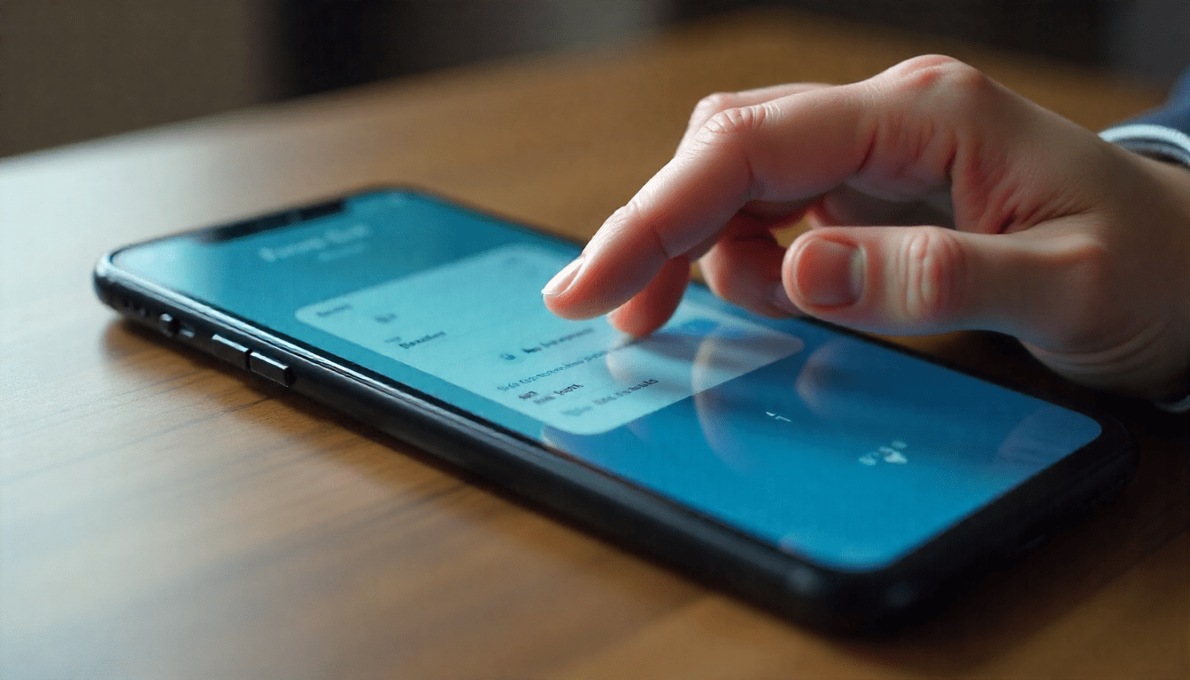
Micro-interactions are the tiny moments that make digital experiences feel alive. The “like” animation on Instagram, the subtle vibration after sending a message, the satisfying “ding” when you complete a task: these are not random details.
They give feedback, create rhythm, and form an emotional connection between human and interface. Done well, micro-interactions make users feel understood. They turn utility into delight. These small details are where technology becomes art.
What are dark patterns in design?
Not all design is ethical. Some interfaces exploit psychology to trick users: a practice known as “dark pattern design.”
Ever tried cancelling a subscription and found the button hidden or greyed out? Or accidentally signed up for something because “No” was in tiny text? That’s manipulation, not design.
Ethical design respects user autonomy. It builds trust instead of exploiting habits. In the long run, transparency outperforms trickery. The future of UI isn’t only smart. It’s responsible.
How is AI reshaping UI design?
AI is reshaping how we design and interact. From AI-powered personalisation to adaptive layouts, interfaces are becoming living systems that evolve based on user behaviour.
Imagine apps that learn your preferences, interfaces that redesign themselves in real time, or assistants that anticipate needs before you tap. AI won’t replace designers. It will redefine their role. The future designer shapes relationships between humans and machines.
The next era of UI isn’t about screens. It’s about experiences that think.
Design as the language of trust
Good UI design doesn’t demand attention. It earns it quietly. It doesn’t impress users. It understands them.
In a world overloaded with choice, clarity becomes kindness. Every colour, curve, and click is a silent promise that says, “We built this for you.”
UI design isn’t only about making things work. It’s about making them feel right. When technology feels human, design becomes connection.
FAQs about the psychology of UI design
How does UI design affect user behaviour?
Every element, from button size to animation timing to colour shade, nudges how users feel and act. The brain takes in about 90% of information visually, so clear layouts reduce cognitive load and keep attention where designers want it.
Which colours build trust in a UI?
Blue is the strongest trust cue, which is why banking and social apps lean on it. Green signals safety and confirmation. Red creates urgency and is best kept for warnings or time-limited offers. Typography adds tone: serif for tradition, sans-serif for modernity.
What is progressive disclosure?
A design principle that reveals information only when it’s relevant. Instead of dumping every option on one screen, the interface guides the user step by step, like a conversation. It keeps complex products usable without overwhelming beginners.
What are dark patterns in UI design?
Interface choices that trick users into actions they didn’t intend, like hidden cancel buttons, greyed-out opt-outs, or tiny “No” links next to large “Yes” buttons. They exploit psychology instead of respecting it, and they usually damage long-term trust even when they lift short-term numbers.
Will AI replace UI designers?
No. AI will redefine the role. Tools now generate layouts and adapt interfaces in real time, but designers still decide intent, ethics, and emotional tone. The future designer shapes the relationship between humans and machines, not only the screens they meet on.