
Short answer: Brand aesthetic is how visual design communicates identity before a single word is read. People form opinions within 50 milliseconds, so colour, typography, and composition decide whether a brand feels trustworthy, creative, or forgettable. In 2025, winning brands blend purpose, flexible design systems, and AI tools like Adobe Firefly, Midjourney, and Figma.
In today’s hyper-digital world, a logo isn’t a logo. It is a story, a vibe, and a personality condensed into colour, shape, and type. From minimalist aesthetics to bold experimental visuals, the design of a brand has become as important as its product. Apple’s iconic simplicity, Nike’s swoosh, or a small café’s carefully curated Instagram feed, design speaks long before words do.
Brand design today isn’t only about standing out. It is about standing for something.
Why do first impressions matter so much?
Humans are visual creatures. Studies suggest we form opinions about brands within the first 50 milliseconds of seeing their design. Your logo, colour palette, and typography are doing most of the talking before a single line of copy is read.
Consider the emotional contrast between the cool professionalism of LinkedIn’s blue and the energetic creativity of Spotify’s green. Both colours subconsciously guide how we perceive those platforms. Blue says “trust me.” Green says “move with me.”
Modern design isn’t about looking good. It is about feeling right. The emotional resonance of visuals can turn a casual visitor into a loyal customer.
Why has minimalism become a silent revolution?
We live in a world of noise: push notifications, pop-ups, never-ending scrolls. That is why minimalism in design has become a quiet rebellion. Brands like Apple, Airbnb, and Glossier have mastered the art of saying more with less.
Minimalist design strips away the unnecessary, leaving only what is essential and meaningful. It is not about emptiness. It is about focus. A clean aesthetic signals confidence and clarity, traits that land with Gen Z and millennials who want authenticity and simplicity in a cluttered digital landscape.
Minimalism isn’t the only language of modern design though.
What is maximalism and why is it back?
On the flip side, maximalism has re-emerged as a vibrant counterculture. Bright colours, bold typography, layered textures, all celebrating imperfection and individuality. Brands like Gucci, Liquid Death, and Fanta are embracing “organised chaos” to connect with younger audiences tired of sterile, copy-paste branding.
Maximalism is storytelling through abundance. It says, “We’re not afraid to be seen.” When online attention spans are short and competition is fierce, bold design becomes a statement of courage.
That creative rebellion shows design trends are cyclical. What’s minimal today could be maximal tomorrow. The real power lies in knowing your audience and designing for emotion, not aesthetics alone.

How does colour communicate brand identity?
Colour theory isn’t new, but the way brands are using it in 2025 is more intentional than ever. Colours are no longer chosen for harmony alone. They are chosen for identity.
Take Spotify Wrapped. Every year, its neon gradients explode across social media, immediately recognisable and emotionally charged. Or look at Starbucks’ seasonal red cups, which have become a cultural event signalling the arrival of the holidays.
Brands are moving beyond “what looks good” to “what feels like us.” That emotional fingerprint, expressed through colour, builds subconscious loyalty, the kind that can’t be bought with ads.
Why is typography the voice you can see?
If colours express emotion, typography delivers tone. Think about the difference between Vogue’s timeless serif and Netflix’s bold sans-serif. One whispers elegance. The other shouts entertainment.
Custom fonts have become a modern status symbol in branding. From Coca-Cola’s hand-lettered curves to Google’s clean geometry, typography is now a brand’s visual voice, instantly recognisable even when the logo is missing.
The trend of variable fonts has changed the game too, letting designers adjust weight, width, and motion for dynamic online experiences. Typography has gone from static to living, breathing identity into digital interfaces.
How are brands winning the social media aesthetic war?
Instagram grids, TikTok visuals, YouTube thumbnails, the battlegrounds of modern branding aren’t billboards or print ads anymore. They are pixels on screens where trends shift weekly.
Brands like Duolingo, Ryanair, and Crocs have mastered social media aesthetic play by blending humour, chaos, and clever design to stay culturally relevant. The key is flexibility.
A static identity doesn’t survive in the era of memes and microtrends. Today’s successful brands build adaptable design systems, visual toolkits that evolve without losing their essence. Think of it as brand DNA: recognisable, but capable of growing.
How is AI changing brand design?
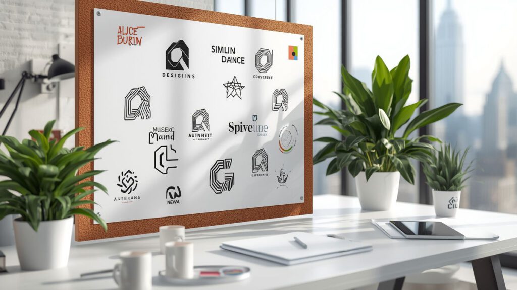
Artificial intelligence is no longer a futuristic concept in design. It is already shaping it. Tools like Adobe Firefly, Midjourney, and Figma’s AI assistants are changing how designers think, create, and iterate.
AI can now generate logo variations, colour palettes, and mood boards in seconds. The real magic happens when human creativity and machine efficiency collaborate. Designers aren’t being replaced. They are being amplified.
The next frontier is emotionally intelligent design. Imagine AI systems that adapt a brand’s visuals based on real-time audience sentiment, a world where your brand could shift its visual tone depending on mood, season, or trending social topics.

Why does purpose beat perfection in design?
Design no longer thrives on perfection. It thrives on purpose. Consumers can spot inauthenticity faster than ever, and they gravitate toward brands that look like they care.
A meaningful visual identity communicates values, sustainability, inclusivity, creativity, rebellion, without having to say a word. A brand that stands for something looks different. It dares to be.
Purposeful design doesn’t just sell products. It builds movements.
Conclusion: The era of emotionally intelligent brands
The future of brand design belongs to those who understand that visuals are not decoration. They are communication. They tell stories, evoke emotions, and bridge the gap between companies and communities.
In 2025 and beyond, the most successful brands won’t only look beautiful. They will feel human. They will make people stop, feel, and remember. That is the true art of design.
FAQs about brand aesthetic design
What is a brand aesthetic?
A brand aesthetic is the overall visual feel of a brand, built from colour, typography, composition, and imagery. It is how a company communicates its personality before anyone reads a tagline, which is why brands like Apple, Spotify, and Vogue feel distinct from the first glance.
How long does a person take to judge a brand’s design?
Studies suggest humans form opinions about brands within the first 50 milliseconds of seeing their design. That is faster than reading a single word, which is why logos, colours, and typography carry so much weight in first impressions.
Should my brand be minimalist or maximalist?
It depends on your audience and message. Minimalism suits brands that want to feel calm, premium, and trustworthy, like Apple or Airbnb. Maximalism suits brands that want to feel bold, playful, and fearless, like Gucci, Liquid Death, or Fanta. Both work when the choice is intentional.
Which AI tools are designers using in 2025?
Adobe Firefly, Midjourney, and Figma’s AI assistants are among the most used for generating logo variations, colour palettes, and mood boards. Designers treat them as co-pilots that speed up iteration, while humans still drive emotional direction and final choices.
Why do Gen Z users care about brand aesthetic?
Gen Z grew up on Instagram, TikTok, and YouTube, where visuals decide whether a brand is noticed. They gravitate toward aesthetics that feel authentic and purposeful, which is why brands like Duolingo, Crocs, and Glossier connect so strongly with younger Indian audiences.